
Chapter 6: Visualization
Now that we know how to explore and wrangle our data, we can move onto the very important task of visualizing it. Seaborn is a Python data visualization library built on top of matplotlib. It makes it easy to create attractive and informative plots with just a few lines of code.
6.1: Histogram of Points Per Game (PPG)
Histograms help show how player scoring is distributed across the league.
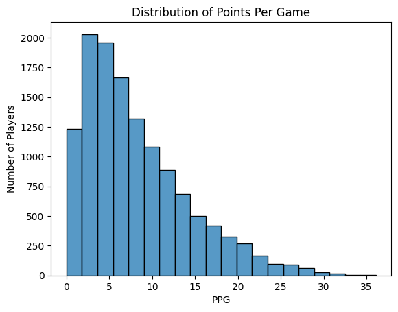
sns.histplot(nba["pts"], bins=20)
plt.title("Distribution of Points Per Game")
plt.xlabel("PPG")
plt.ylabel("Number of Players")
plt.show()
6.2: KDE of PPG
KDE plots smooth the histogram, making it easier to identify peaks and trends in player scoring.
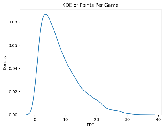
sns.kdeplot(nba["pts"])
plt.title("KDE of Points Per Game")
plt.xlabel("PPG")
plt.show()
6.3: Scatterplot: Height vs PPG
Scatterplots help reveal trends and outliers between two continuous variables — here, height and scoring.
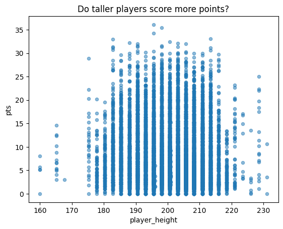
nba.plot.scatter(x = 'player_height', y = 'pts', alpha = 0.5)
plt.title('Do taller players score more points?')
plt.show()
6.4: Regression Line (lmplot)
This plot overlays a regression line to visualize and quantify the linear relationship between height and scoring.
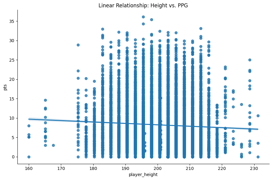
sns.lmplot(x="player_height", y="pts", data=nba, height=6, aspect=1.5)
plt.title("Linear Relationship: Height vs. PPG")
plt.tight_layout()
plt.show()
6.5: Boxplot of PPG
Boxplots summarize the median, quartiles, and potential outliers in scoring data.
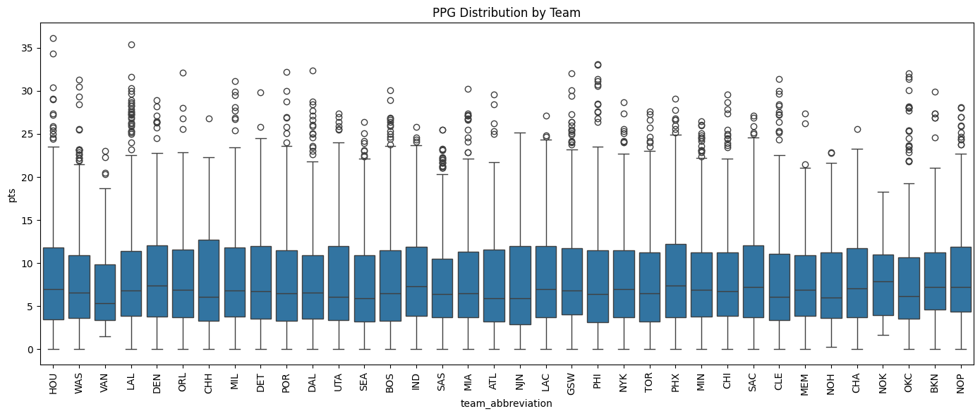
plt.figure(figsize=(14, 6))
sns.boxplot(x="team_abbreviation", y="pts", data=nba)
plt.title("PPG Distribution by Team")
plt.xticks(rotation=90)
plt.tight_layout()
plt.show()
6.6: Violin Plot of PPG by College
Violin plots combine boxplots with KDEs to show both the distribution shape and summary stats of PPG across colleges.
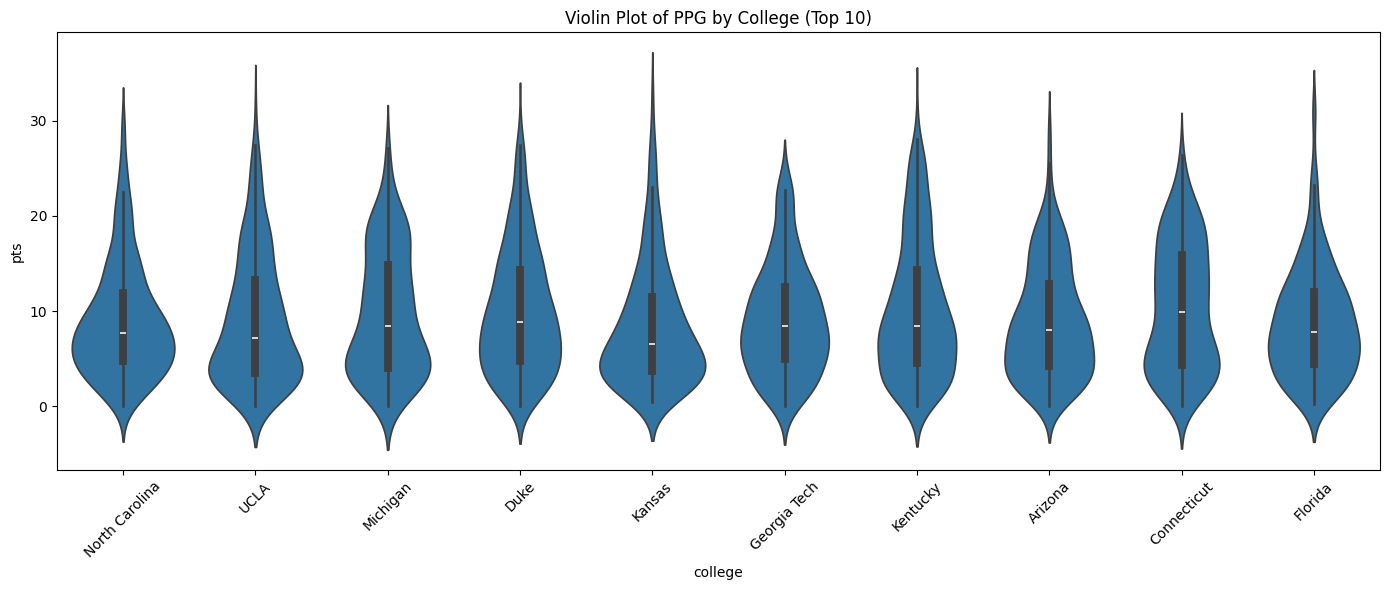
top_colleges = nba["college"].value_counts().head(10).index
filtered = nba[nba["college"].isin(top_colleges)]
plt.figure(figsize=(14, 6))
sns.violinplot(x="college", y="pts", data=filtered)
plt.title("Violin Plot of PPG by College (Top 10)")
plt.xticks(rotation=45)
plt.tight_layout()
plt.show()
6.7: Correlation Heatmap
Heatmaps visualize how strongly variables like height, weight, and age are correlated with PPG.
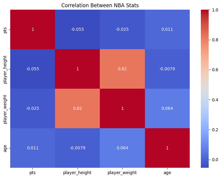
corr = nba[["pts", "player_height", "player_weight", "age"]].corr()
plt.figure(figsize=(8, 6))
sns.heatmap(corr, annot=True, cmap="coolwarm")
plt.title("Correlation Between NBA Stats")
plt.tight_layout()
plt.show()
6.8: Parting Notes
We have displayed a various amount of seaborn plots and it is important to know when to use each plot in their proper contexts. There are many more plots than these and we impore you to look at the rest of the plots that seaborn has to offer! Now that we know how to use pandas we recommend the machine learning course if you are interested in now exploring data science applications for inference and decision making.